

remix
Platforms

Project Overview
Overview
In 2023–2024 I led the design of swatchbook remix, a cross-device product design application for Apple Vision Pro, iPad, and iPhone, developed in partnership with The Shoe Surgeon.
Remix enables users to apply materials to footwear, apparel, and other products in real time using immersive 3D tools. The goal was to make professional product customization accessible to both designers and everyday users.
The app launched as one of the few applications available on day one of Apple Vision Pro and was featured by Apple in Apps We Love, Hot This Week, and Create on an Infinite Canvas in the Vision Pro App Store.

My Role
I worked hands-on as a product designer while also overseeing the design team responsible for delivering the experience across devices.
- Cross-device UX strategy
Designed a consistent core workflow across Vision Pro, iPad, and iPhone while adapting interactions to each platform’s strengths. - Research and usability testing
Conducted usability studies and A/B tests to refine material assignment, part selection, and editing workflows. - Cross-functional collaboration
Worked closely with engineering to ensure performance across devices and with leadership to prioritize features for launch. - Design iteration
Led multiple design cycles, continuously refining the product through testing and user feedback.
The Challenge
Spatial computing introduced a new interaction paradigm for creative tools. For remix, the design challenge was to:
• Present complex 3D product editing workflows in a way that felt simple and approachable
• Make material swapping and part selection fast and fatigue-free in spatial environments
• Maintain a consistent design experience across devices while leveraging each platform’s strengths
Unlike traditional mobile apps, remix needed to support a range of contexts — from immersive spatial interaction on Vision Pro to quick AR exploration on iPhone and more focused design sessions on iPad.
The challenge was to design a system where the core workflow remained familiar, while the interaction model adapted to each device’s capabilities.

Designing Across Devices
The key principle guiding Remix was maintaining a consistent core experience while adapting interactions to each device’s affordances.
Each platform supported a different type of creative moment.
Vision Pro — immersive exploration
Spatial interaction allowed users to manipulate 3D models directly in their environment. Users could grab, move, and inspect products at full scale.
iPhone — spontaneous creativity
Mobile AR allowed quick experimentation anywhere, supporting short bursts of creativity and rapid iteration.
iPad — focused design sessions
The larger screen enabled more deliberate design exploration while maintaining access to AR visualization.
This approach ensured that the mental model of the product remained consistent, while the interaction methods adapted naturally to each device.
Execution
Key Design Decisions
Designing remix required balancing familiar interaction patterns with the possibilities of spatial computing.
Spatial UI with familiar navigation
Apple’s Human Interface Guidelines recommend maintaining familiar UI patterns in spatial environments to reduce cognitive load. To follow this principle, the main navigation remained within a traditional windowed interface, while the 3D product model was placed directly in the user’s physical space.
This approach allowed users to interact with products more naturally while still benefiting from familiar UI structures.
Users could:
- grab and reposition models
- bring objects closer for inspection
- directly touch product components to select them
Because objects could vary significantly in size, the system also needed to calculate initial placement and scale so that models appeared at an appropriate distance from the user.

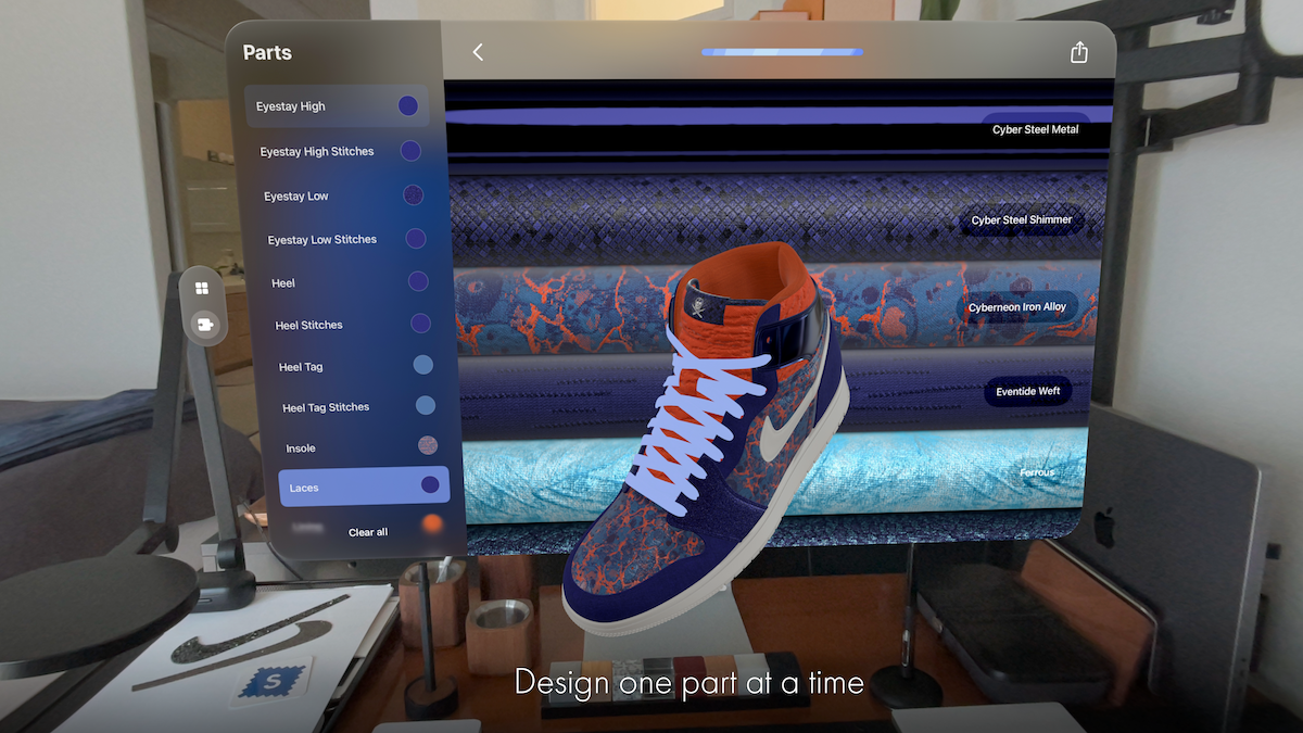
Flexible part selection
Selecting product components is a core action in Remix.
To support different contexts and levels of model complexity, multiple selection methods were introduced:
- Eye gaze selection (Vision Pro)
- Tap interaction
- List-based selection
List-based selection was especially important for complex models with small elements such as stitching or hardware.
Clear visual states were also designed to help users understand which elements were selected — a particularly important requirement when navigating with eye tracking in spatial environments.

Material assignment
Once a component was selected, users could apply materials using the same interaction model.
Materials were presented as scrollable collections of digital fabric rolls, making the interaction visually consistent with physical material libraries used in fashion design.

Testing & Iteration
Several workflows were refined through usability testing and A/B experimentation across all three platforms. One key experiment focused on material and part selection interfaces.
Three interaction patterns were tested:
- floating toolbar with exposed functions
- icon-based function grouping
- contextual interaction panels
Increasing the visibility of primary functions significantly improved efficiency. For simpler models, exposing key functions directly reduced time-on-task by 16%. For more complex models, a slightly more compact icon-based interface proved more effective, balancing clarity with visual simplicity.


Encouraging Engagement
Because Remix targeted both professional designers and casual creators, user engagement was an important consideration. Research into mobile engagement patterns informed the design of several retention features, including:
- curated content drops
- design challenges and events
- theme-based collections
- push notifications announcing new assets
These mechanisms helped encourage repeat usage, particularly on mobile devices where users often engage in shorter creative sessions.


Results
Results
- Launch and platform recognition
Remix was one of the few applications available on day one of Apple Vision Pro and was featured by Apple in Apps We Love, Hot This Week, and Create on an Infinite Canvas in the Vision Pro App Store. - Improved workflow efficiency
Usability testing and A/B experimentation reduced material and part selection time by 16% in key workflows, improving the speed of the design process. - High user engagement
Users created an average of 10 designs per session, indicating strong engagement with the creative workflow. - Cross-device adoption
Remix was used across Vision Pro, iPad, and iPhone, allowing teams to explore designs in immersive environments while also supporting quick iteration on mobile devices. - Business impact
The launch strengthened Swatchbook’s positioning in immersive product design, helping demonstrate new possibilities for spatial design tools in fashion and product development.
Reflection
Designing remix challenged me to think differently about UX across devices. It taught me the importance of balancing core consistency with device-specific affordances and highlighted how thoughtful interaction design can lower barriers to immersive creation.


.png)


